Reducing cart abandonment: the changes that actually work
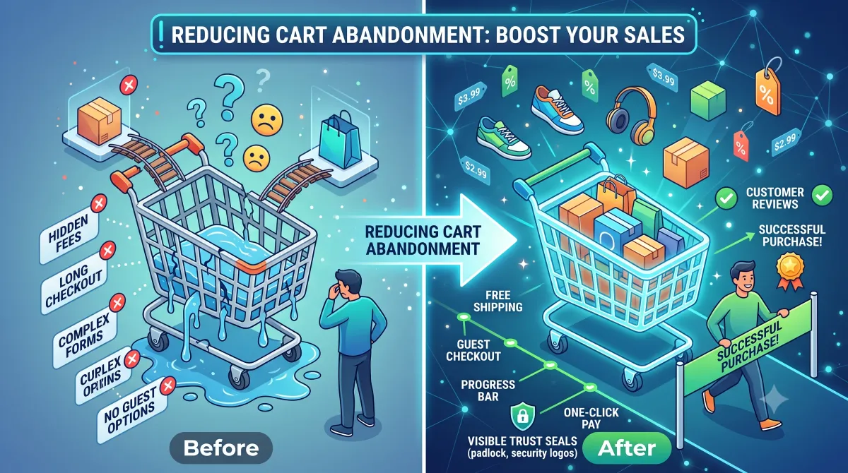
Show the delivered total before checkout begins — unexpected shipping cost is the most commonly cited abandonment reason in every study of the subject. After that: offer guest checkout prominently, remove fields that are not genuinely required, show errors inline beside the field, and display accepted payment methods early.
Cart abandonment advice is mostly a list of tactics with no ordering. This is the ordering, because the first item matters more than everything after it combined.
Show the delivered total before checkout begins
Unexpected extra cost is the most commonly cited abandonment reason in every study of the subject. Shipping, taxes and fees appearing at the final step, after the customer has invested time, is the single biggest leak in most stores.
It is also largely within your control:
- Show delivery cost, or a clear estimate, on the product page
- Show the full delivered total in the cart, before checkout begins
- If a free-shipping threshold exists, show progress toward it
- If costs genuinely cannot be known before an address is entered, say so explicitly rather than leaving a blank
The goal is that nothing at the final step is a surprise. A customer who knows the total and proceeds anyway has already accepted it.
Make guest checkout the obvious option
Forcing account creation sits near the top of every abandonment study, and the accounts you gain that way are largely worthless — created under duress, never used again.
Offer guest checkout prominently. Not hidden below a login form, not styled as the lesser option. Then invite account creation after the order is placed, when the customer has an actual reason to say yes: order tracking, faster reordering, saved addresses.
Remove every field you do not use
Audit what you collect against what anybody actually uses.
The usual suspects: company name on a consumer store, second address lines, phone numbers nobody calls, “how did you hear about us” on the checkout form rather than after it.
Each removed field is a small increase in completion, and they compound. This is one of the cheapest changes available and it is skipped because nobody owns the form.
Fix the error handling
Error handling is where checkouts lose people who had every intention of buying.
- Show errors inline, beside the field, not as a summary at the top
- Say what to do, not that something is invalid: “Enter an email address so we can send your receipt” beats “Invalid input”
- Validate as the customer moves through the form, not only on submit
- Never clear entered data when an error occurs — that is the fastest way to lose someone entirely
- Move focus to the first field with a problem
That last point is both a usability improvement and an accessibility requirement.
Show payment methods early
Customers who intend to pay with a specific method want to know it is available before investing effort. Show accepted cards, digital wallets and any buy-now-pay-later options in the cart, not at the final step.
If you offer a wallet that skips most of the form, put it at the top of checkout where it can be chosen before someone starts typing.
Make it work properly on a phone
Most abandonment happens on mobile, and a substantial share is mechanical rather than motivational:
- Correct input types, so numeric keyboards appear for numeric fields
autocompleteattributes so saved details fill in- Targets large enough to hit accurately
- Forms usable one-handed
- No layout shift as the page settles
None of this is glamorous. All of it is measurable.
Do not oversell recovery emails
Abandoned-cart emails work, within limits. They recover some orders, and they are worth having.
They are not a substitute for fixing why people left. A recovery email for a customer who abandoned over unexpected shipping cost is asking them to accept the thing they already rejected. Fix the cause, then let the email catch genuine distractions.
Accept that some abandonment is healthy
A meaningful share of carts are not purchase attempts at all. Customers use carts as wishlists, as price comparison tools, and as a way to check delivery cost before deciding.
Published abandonment figures around seventy percent include all of that. Track your own trend rather than benchmarking against an industry average, because the composition of your traffic determines what “normal” means for you far more than the sector does.
Measure it properly
Before changing anything, record checkout completion rate and the step where people leave. Afterwards, compare the same two numbers over a full traffic cycle.
Checkout is one of the few places on most stores with enough volume for genuine A/B testing. If you are going to test anything rigorously, test here. Elsewhere, as covered in the product page checklist, most stores lack the traffic for meaningful results.
Where to start if you can only do three things
In order:
- Put delivery cost and estimated arrival on the product page, not only at checkout. This is the highest-value change available on most stores and it is a content change rather than a development one.
- Make guest checkout obvious. Not present-but-hidden. Obvious.
- Remove every checkout field nobody uses. Audit against what your fulfilment process actually needs.
None of those requires a redesign, and together they address the top three reasons cited in essentially every abandonment study.
Diagnosing your own funnel
Before applying any of this, find out where your customers actually leave. The pattern differs by store and the fix differs with it.
High cart abandonment, low checkout abandonment — people are adding to cart and never starting checkout. Usually a pricing or delivery-cost surprise at the cart step, or carts being used as wishlists.
Low cart abandonment, high checkout abandonment — people commit and then stall. Look at form length, required fields, payment method availability and error handling.
Abandonment concentrated on mobile — check the mechanical things first. Input types, autocomplete, target sizes, layout shift. Motivation is rarely the issue when desktop converts fine.
Abandonment concentrated at the payment step — a payment method customers expect is missing, or the step is failing for some cards and nobody has noticed. Check your error logs rather than guessing.
That last case is worth emphasising. Genuine checkout errors are more common than people assume, and they are invisible from the outside because the affected customers simply leave. Reading payment failure logs occasionally is unglamorous and occasionally alarming.
What good looks like
A checkout worth having:
- The delivered total is known before checkout begins
- Guest checkout is the obvious default
- Every field present is a field that gets used
- Errors appear beside the field, in plain language, without clearing entered data
- Payment methods are visible early, and wallets sit at the top
- It works one-handed on a phone with saved details filling in
- Somebody reads the payment failure logs occasionally
None of that is novel and most stores fail at least three of them.
One more thing
Check that your checkout actually works, on a real phone, on a real network, this week. Not a staging copy — the live one, with a real card, refunded afterwards.
We have found genuinely broken checkouts on stores whose owners had no idea, because the affected customers simply left and nobody reports a checkout that quietly fails.